Theme Customization
The Hubble SDK offers a high degree of visual customization to ensure it seamlessly matches your application's branding and user interface.
Experience Center
The Experience Center is an interactive tool that lets you preview theme customizations in real-time before applying them to your integration.
To get started quickly, use Auto-fill from website - enter your store URL or upload a screenshot, and the Experience Center will generate a matching theme using AI.
What You Can Customize
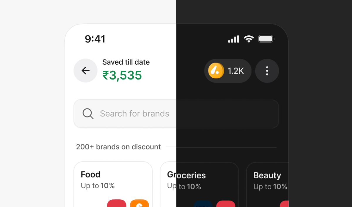
- Logo: Add your own logo in the header
- Fonts: Choose from available fonts (Inter, Plus Jakarta, Roboto, Poppins, Open Sans, DM Sans) or add your own custom font library
- Brand Colour: Set your primary brand colour, applied to store header and buttons
- Reward Colour: Customize the colour used to highlight rewards and discount percentages
- Roundness: Adjust corner radius for search bar and buttons
- Individual Elements: Customize search bar, buttons, brand thumbnails, and more based on your brand guidelines
Customization Scope
The Hubble SDK supports flexible visual customization while preserving functional consistency across flows. All supported customizations are token and component driven.
Themes
- Switch between Light and Dark themes
- Theme switch applies globally across all screens
Setting Theme via URL
You can set the theme dynamically using a URL query parameter:
theme=light— Light Themetheme=dark— Dark Theme
Example:
https://{baseUrl}/?clientId=[..]&clientSecret=[..]&token=[..]&theme=dark
Base URLs:
- Development:
https://sdk.dev.myhubble.money - Production:
https://sdk.myhubble.money
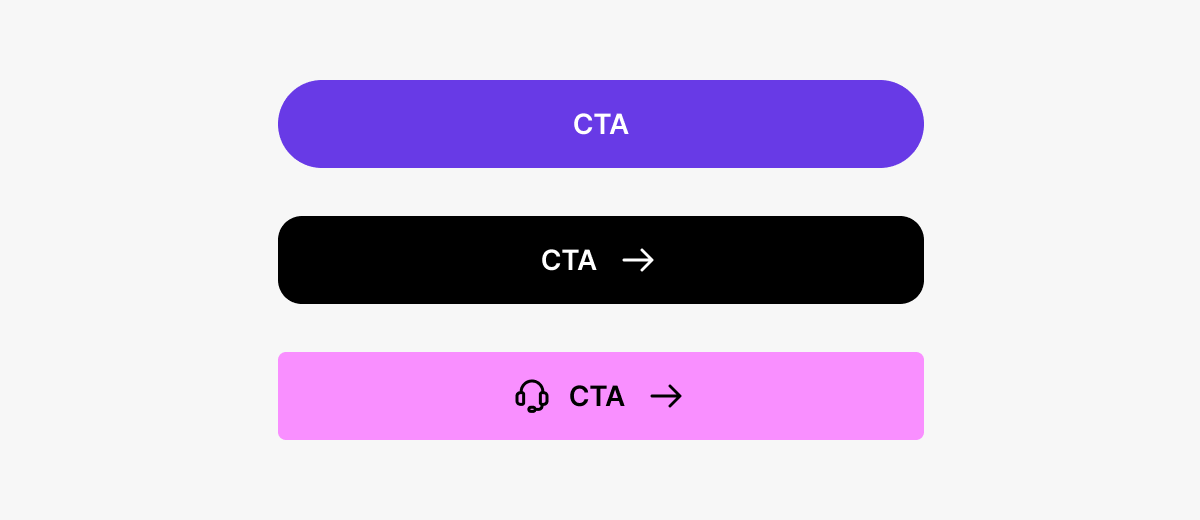
Buttons
Customizable properties:
- Fill colour
- Button text colour
- Corner radius
- Shadows (optional)
Button states (default, pressed, disabled) remain consistent and auto-update.
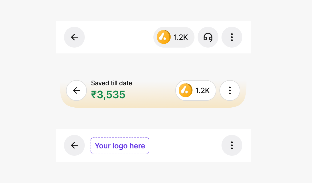
Header
Configurable options:
- Title type: Savings amount / Logo / Empty
- Header style: Curved or Straight
- Header fill colour
- Show or hide coin balance
- Enable or disable stroke
- Brand logo placement
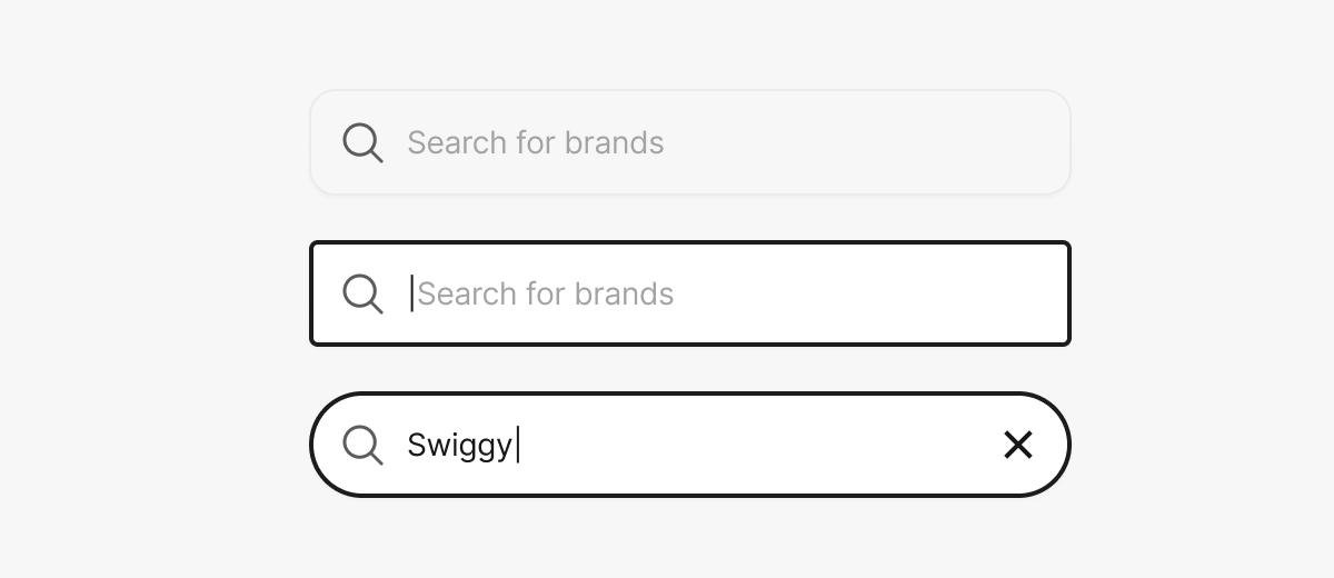
Search Bar
Customizable properties:
- Background colour
- Corner radius
Typography
- Modify Primary, Secondary, and Tertiary text colours
- The file has predefined text styles (Titles, Paragraphs, Labels, Captions)
- Replace font family using Uwarp font replacer plugin
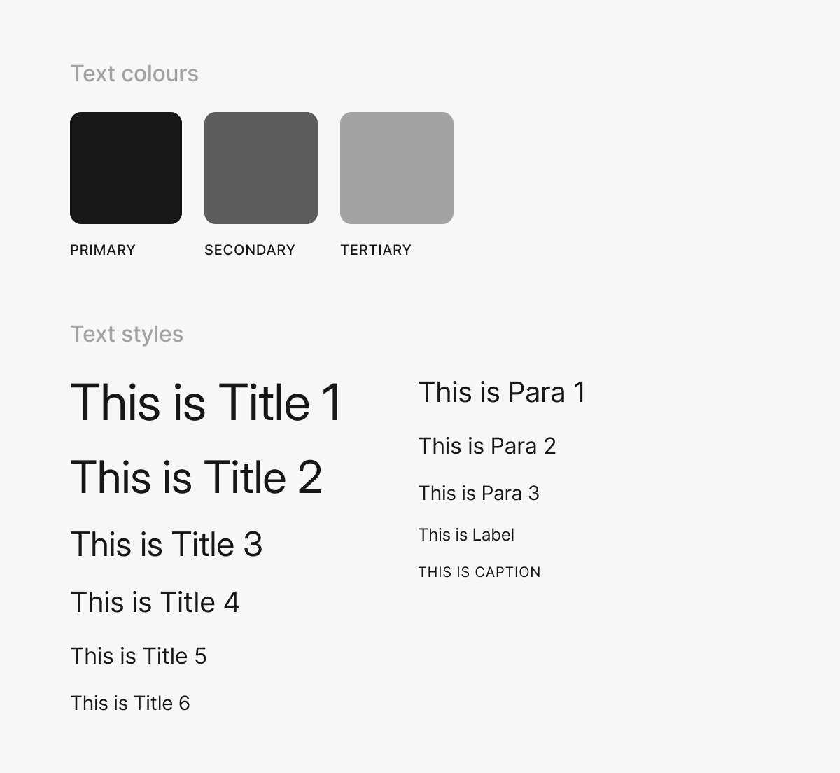
Image Dimensions
Below are the standard dimensions and aspect ratios for key visual elements used within the Hubble SDK:
Coin Image
| Property | Value |
|---|---|
| Width | 20 px |
| Height | 20 px |
| Aspect Ratio | 1 : 1 |
| Format | PNG (transparent background) |
Header Logo
| Property | Value |
|---|---|
| Width | 96 px |
| Height | 40 px |
| Aspect Ratio | 12 : 5 |
| Format | PNG or SVG |
Banner
Mobile
| Property | Value |
|---|---|
| Width | 335 px |
| Height | 134 px |
| Aspect Ratio | 5 : 2 |
| Border Radius | 1 rem |
| Format | PNG or JPG |
Web
| Property | Value |
|---|---|
| Width | 992 px |
| Height | 181 px |
| Aspect Ratio | 11 : 2 |
| Border Radius | 1 rem |
| Format | PNG or JPG |
Ensure your theme customization is complete and tested in staging before going live. While theme changes can be made at any time, a mismatched or incomplete theme creates a poor first impression for users.
Theme updates apply to all new SDK sessions within minutes of saving in the integration portal. No code changes or deployments are required on your side.