Theme Customisation
A guide to customising the look and feel of the Hubble SDK.
The Hubble SDK offers a high degree of visual customisation to ensure it seamlessly matches your application’s branding and user interface.
Design System
We have prepared a comprehensive Figma design system that details all the components used in the SDK and the scope of customisations available for each. You can use this file to see what’s possible and to design your ideal theme.
View the SDK Design System on Figma
How to Use the Figma File
- Create a Copy: Make a copy of the Figma file to your own workspace.
- Customise: Make the desired changes to the screens and components.
- Share with Us: Once you are happy with the changes, share the file with the Hubble team, and we will work with you to implement your custom theme.
Customisation Scope
The Hubble SDK supports flexible visual customisation while preserving functional consistency across flows. All supported customisations are token and component driven.
Themes
- Switch between Light and Dark themes
- Theme switch applies globally across all screens
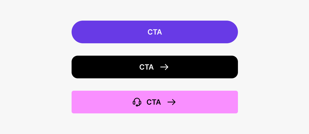
Buttons
Customisable properties:
- Fill colour
- Button text colour
- Corner radius
- Shadows (optional)
Button states (default, pressed, disabled) remain consistent and auto-update.
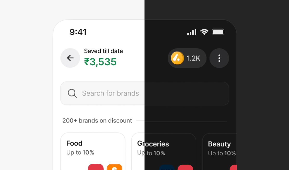
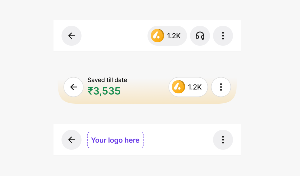
Header
Configurable options:
- Title type: Savings amount / Logo / Empty
- Header style: Curved or Straight
- Header fill colour
- Show or hide coin balance
- Enable or disable stroke
- Brand logo placement
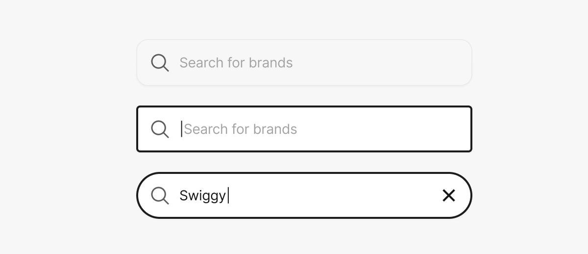
Search Bar
Customisable properties:
- Background colour
- Corner radius
Typography
- Modify Primary, Secondary, and Tertiary text colours
- The file has predefined text styles (Titles, Paragraphs, Labels, Captions)
- Replace font family using Uwarp font replacer plugin
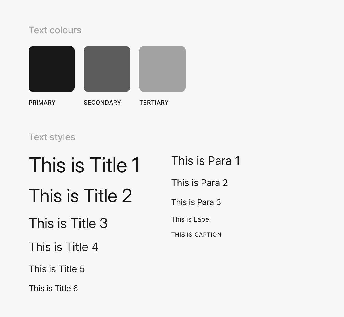
Image Dimensions
Below are the standard dimensions and aspect ratios for key visual elements used within the Hubble SDK:
Coin Image
- Width: 20 px
- Height: 20 px
- Aspect Ratio: 1 : 1
Header Logo
- Width: 96 px
- Height: 40 px
- Aspect Ratio: 12 : 5
Banner
- Width: 353 px
- Height: 199 px
- Aspect Ratio: 16 : 9
- Border Radius: 1 rem